Hi I'm Alex, I make exciting and delightful human-centered products from start to finish.
Currently I'm working as a Senior Product Designer at Wpay where I help shape the future of the effective learning for more than 1 million students.
Portfolio Quick links
Everyday Pay
Wpay
2021 - CURRENT
Pedlar
Wpay
2021 - CURRENT
Service NSW Account
Wpay
2021 - CURRENT
Everyday Pay
Creating a More Intuitive Way to Pay
Everyday Pay enables customers to make in-store payments through a pre-existing loyalty app. As the Lead UX Designer, I led the product's evolution from MVP to Version 2. In this case study, I will outline the process and solutions implemented to improve the user experience of the product.

Context
Joining Wpay
I joined my team at Wpay two months before the launch of the first MVP of Everyday Pay. At that stage, the product had already undergone significant development, with minor adjustments being made to a few product flows.
Discovery
Conducting Comprehensive Research
Following the MVP launch, user feedback, data analysis of customer behaviour and qualitative in-store testing revealed key issues:
- Sign-up Ambiguity: Users found the sign-up process confusing, resulting in drop-offs.
- Difficulty Adding Cards: Adding payment methods proved cumbersome, discouraging usage.
- Speed and Reliability: Performance issues impacted user experience.
- Lack of Clear Value Proposition: Customers were unclear about the product's benefits.
- NFC Interference: Scanning QR codes was problematic due to NFC technology interference.
- Lack of Staff Knowledge: Store staff struggled to assist customers effectively.
- In-Store Usability Issues: Customers experienced frustrations while using the product in-store.
Storyboards

In-store storyboards for stakeholder playback
Journey Mapping In-store Experience
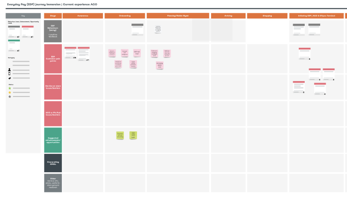
Map of our customers experience in-store
Post Testing Interview

Alvin and I interviewing a customer post Usability Testing
Verbatim Synthesis

Synthesis of verbatim from multiple sources for stakeholder playback
Problem Definition
Turning Problems into actionable statements
By formulating the identified customer problems as "How might we" statements, we shift the focus towards generating innovative solutions and unlock opportunities for addressing these issues effectively.
Problem #1
How might we simplify the sign-up process to enhance user navigation, minimize confusion, and reduce potential drop-offs?Problem #2
How might we address the issues caused by NFC interference when scanning QR codes to ensure a seamless experience for users?Problem #3
How might we streamline the process of adding payment methods to Everyday Pay, making it more user-friendly and encouraging users to utilize the service?Problem #4
How might we improve the in-store usability of the product to eliminate customer difficulties, enhance user experience, and reduce frustration?Problem #5
How might we effectively communicate the value proposition of Everyday Pay to customers, increasing their motivation to adopt and utilize the product?
Driving Change
Recognizing the significant UX issues that surfaced, my project manager and I strongly advocated for a comprehensive product overhaul. We firmly believed that addressing these challenges required a replatforming effort, and we successfully influenced the strategic direction of Everyday Pay. As a result, the decision was made to pivot away from the open-to-all model and instead focus on enhancing the product's functionality within the ecosystem.
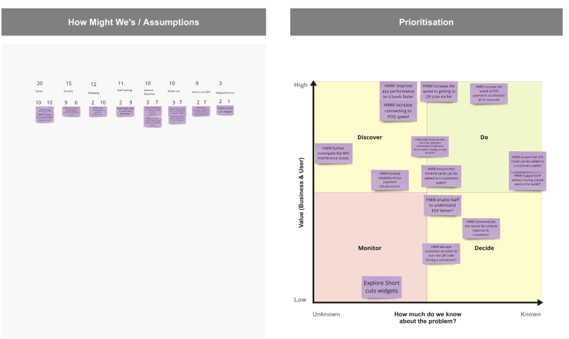
I facilitated a workshop to prioritize the most important problems to solve.
Ideation
Kickoff & Ideation Workshop
To address these challenges, I led a kickoff and ideation workshop with the product team, utilizing the Lotus Blossom technique. This collaborative session allowed us to generate a diverse range of ideas and prioritize the most promising ones for prototyping.
Asynchronous workshop

In-store storyboards for stakeholder playback
Lotus Flower Ideation

Map of our customers experience in-store
Verbatim Synthesis
Synthesis of verbatim from multiple sources for stakeholder playback
Develop
A Thoughtful and Iterative Approach
To effectively implement the desired changes, we devised a comprehensive delivery plan that involved breaking down the releases into five iterative drops. We prioritized quick wins to address critical pain points and deployed them early to gather prompt feedback. Throughout the development process, we followed an agile approach, actively incorporating user feedback in an iterative manner.
Designs
In collaboration with fellow designers in my squad, I presented the designs to key stakeholders for their input and opinions. These sessions were valuable for gathering assumptions and perspectives to be evaluated during testing.
Testing
Each iteration underwent testing sessions, both moderated and unmoderated, utilizing maze.com to gather valuable insights and feedback.

Pictured: The research report compiled to present the results from testing.
Iterate
Throughout the process, we conducted three iterations that addressed feedback gathered from previous testing sessions, allowing us to refine and improve the product.

Pictured: Three iterations of the onboarding entry point.

Pictured: Three iterations of the wallet bottom sheet.
Deliver
Final Designs
To effectively implement the planned changes, we developed a comprehensive delivery plan that involved breaking down the releases into five iterative drops. Quick wins, addressing critical pain points, were prioritized and deployed early to gather prompt feedback from users.

Improving the In-store Experience
We made the following changes to enhance the in-store payments experience, specifically addressing the identified issues:
-
Problem #4
How might we improve the in-store usability of the product to eliminate customer difficulties, enhance user experience, and reduce frustration?
Prioritizing QR Scan
We redesigned the wallet tab, merging the old QR scan window with the wallet interface. This prioritized the payment experience over the barcode scan, which had previously confused customers during in-store transactions. The new design also provided users with clear visibility of their payment methods and gift card balance without the need to open the wallet separately.

Onboarding Improvements
We made the following changes to enhance the onboarding experience, specifically addressing the identified issues:
-
Problem #1
How might we simplify the sign-up process to enhance user navigation, minimize confusion, and reduce potential drop-offs? -
Problem #5
How might we effectively communicate the value proposition of Everyday Pay to customers, increasing their motivation to adopt and utilize the product?
A More Obvious Entry Point
We replaced the original tooltip entry point with a more conventional banner and button, providing a clearer and more intuitive way for users to begin the onboarding process.

One-page Value Proposition
We redesigned the value proposition to fit on a single page, improving readability and eliminating any confusion related to carousel swiping or the need to tick a checkbox for terms and conditions acceptance. This change followed existing in-app design patterns and enhanced accessibility.

Adding Payments
We made the following changes to simplify the process of adding cards to the wallet, addressing the identified issue:
-
Problem #3
How might we streamline the process of adding payment methods to Everyday Pay, making it more user-friendly and encouraging users to utilize the service?
Add Payment Method Page
We incorporated design patterns from Google, Apple, and Samsung Wallets by adding an "add" button to the wallet page, simplifying the process of adding payment methods.

Enabling Card Scanning
During an ideation session with the tech team, we identified optical character recognition (OCR) as a viable solution. To implement this feature, we leveraged an external library, enhancing the user experience. The styling of the OCR feature aligned with the overall design aesthetic.

Accessibility
Ensuring Inclusivity
In the Develop phase, we prioritized accessibility by implementing features such as voiceover support for screen readers, a high contrast mode for users with visual impairments, and optimized keyboard navigation. These enhancements aimed to provide an inclusive and accessible experience for all users.

Metrics for Success
Measuring Impact
To assess the impact of the implemented changes, we established clear metrics for success, including:
- Onboarding Finalization Rate: The percentage of users who successfully completed the sign-up process.
- Reduction in User Errors: The decrease in user-reported errors or issues encountered during the payment process.
- Time to Complete a Transaction: The average time taken by users to complete a transaction using Everyday Pay.
- Customer Satisfaction Score: Feedback collected through in-app surveys or post-interaction interviews to assess overall satisfaction with the updated user experience.
- Increase in Adoption Rate: The percentage of users who actively used Everyday Pay for in-store payments after the updates were implemented.
Results
A Successful Redesign
The results of the redesign were significant, with a 130% increase in onboarding completion, an 80% decrease in the need for help guides, and notable improvements in speed and reliability. User adoption also saw a considerable boost.

Pedlar
Designing and Launching a Three-Way Marketplace
Founders Josh and David approached me to turn their idea of a three-way influencer marketplace into reality. Despite their limited product experience, they had an ambitious deadline for launching the product. In response, I thoroughly reviewed their brief, business proposal, and supporting documentation, and pitched a 12-week timeline to bring their vision to life.

Client
Sector
My Role
Time
Team
Pre-Project
Assumptions Mapping and Roadmap
To gain a deeper understanding of the target audience, I conducted an initial workshop and outlined a set of assumptions that required validation. Utilizing these insights, I developed a comprehensive roadmap, detailing the key milestones and deliverables needed to achieve our goals.

Kickoff Workshop
To gain a deeper understanding of the problems founder Josh and Davide were looking to solve I conducted an initial workshop to outline all the assumptions that required validation. The output of the session helped me plan out the 12 week engagement and roadmap.
Icebreaker

xxx
Sprint roles

xxx
Project Map

xxx
Ways of Working
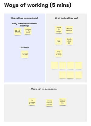
xxx
Team Principals

xxx
Discovery
Influencer and End User Insights
Our first step was to validate the idea with influencers. Through careful recruitment and engagement, we gathered feedback from a panel of five influencers. Additionally, we reached out to ten end users to gain insights into their buying habits and preferences.

Brand Workshop
Defining Personality and Visual Identity
Conducting a brand workshop, I facilitated discussions to establish the brand's personality and key attributes. We also refined the visual identity to ensure its resonance with the target audience.
Empathy Mapping

xxx
Brand Personality Workshp

xxx
Visual Identity Workshop

xxx
Define
Planning Deliverables and MVP Definition
To plan our deliverables and refine the minimum viable product (MVP) and Version 1 (V1), we conducted a collaborative user story mapping session. This process enabled us to align our goals, prioritize features, and streamline the development process.

Ideation
Collaboration Ideation
Following the user story mapping session, I facilitated an engaging ideation session to harness the collective creativity of the team and generate innovative solutions to address the identified pain points and improve the user experience. The session involved cross-functional stakeholders, including designers, developers, and product managers. To create an open and collaborative environment, I employed various brainstorming techniques such as "Crazy Eights" and "Mind Mapping." Participants were encouraged to think outside the box and share their ideas freely. Through active facilitation, I ensured that all ideas were captured, discussed, and evaluated objectively. The session sparked lively discussions, fostering a sense of shared ownership and generating a wide range of concepts and solutions. By leveraging the diverse expertise and perspectives of the team, we were able to explore creative possibilities and identify promising directions for enhancing the user experience.
Design
Crafting Intuitive User Experience
Taking the lead in product design, I created an intuitive user experience and visually engaging interface. While the founders were eager to expedite the launch, I ensured the initial design was robust and user-centered.
Wireframing
Lorem ipsum dolor sit amet, consectetur adipiscing elit, sed do eiusmod tempor incididunt ut labore et dolore magna aliqua.

MVP Desgins
Lorem ipsum dolor sit amet, consectetur adipiscing elit, sed do eiusmod tempor incididunt ut labore et dolore magna aliqua.


Design System and Brand Guidelines
Ensuring Consistency
As part of the project, I developed a comprehensive design system and brand guidelines. This cohesive framework maintained consistency and empowered the team to iterate and scale the product efficiently.
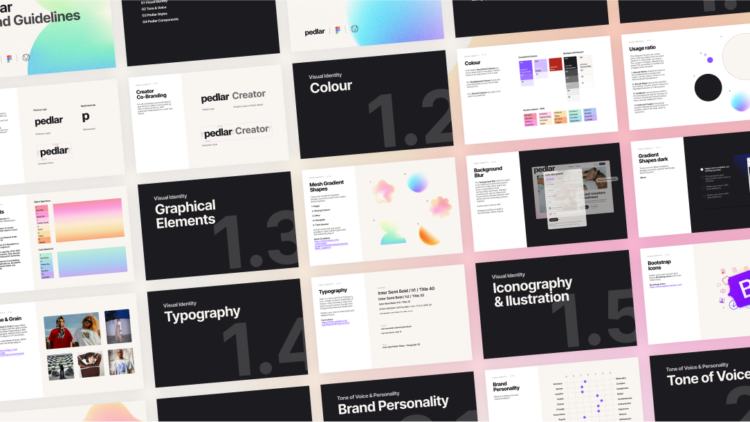
Component Library
To streamline the component library I utilised existing resources in the form of Material 3 Libraries and applied new styling to it

Conclusion
Demonstrating Expertise in UX/UI Design
This project showcases my ability to transform an idea into a live product within a demanding timeline. By incorporating user-centered research, facilitating productive workshops, and designing an intuitive interface, I demonstrated my expertise in creating impactful user experiences. The comprehensive design system and brand guidelines I developed exemplify my commitment to cohesive and scalable design solutions.
Service NSW
Optimising the Account Experience for 5.5M NSW Residents
Joining the MyServiceNSW Account team during the re-platforming of the MySNSW Account portal, I took charge of the design process while my colleagues focused on urgent side projects. This case study highlights the steps taken to enhance the account experience for the 5.5 million residents of New South Wales (NSW) by addressing customer pain points and streamlining usability.

Employer
Sector
My Role
Entire product design from research to conception, visualisation and testing
Time
Discovery
Unveiling Customer Issues
Upon joining the team, I delved into the detailed discovery process already conducted, uncovering critical issues associated with the account experience. These included navigation and information architecture challenges, confusion stemming from inaccurate labels and an agency-centric focus, and a lack of on-screen assistance hindering customer self-help.
