‹ Back
- Projects
- /
- TIMPL
TIMPL Construction
Building Human Potential
Experienced Builders Danny and Tony reached out to me for a brand and web presence for their new construction company, TIMPL.

Client
Sector
My Role
Time
Team
Visual Design
Logo Design
The company name TIMPL is a combination of "time" and "people," which we took into account when designing the logo.

Dynamic Monomark
The logo is a hexagon with two arms representing time. As the arms move around the hexagon, they create the shape of a cube, reminiscent of a clock. This dynamic monomark allows for playful use of the logo on various documents.


Colour
Danny and Tony requested vibrancy and differentiation in the colours. We provided that with Mandarin and Mint, which represent their youthful company and growth, respectively. Additionally, we added TIMPL Navy as the primary colour to provide a solid foundational element to the brand.

Font
The fonts selected reflect the founders' desire to be young and different while maintaining a sense of professionalism.
GT Alpina
Say something important with ‘GT Alpina’
GT Alpina has a bold, modern personality with references to historical typeforms. Its unique design details enhance its character while maintaining a steady rhythm and measured proportions. This font was chosen to reflect some of TIMPL's brand attributes.
Banana Grotesk
Have a friendly conversation with ‘Banana Grotesk’
Banana Grotesk is buttoned-up and conversational, yet approachable and warm. With its classic sans-serif form, it can speak directly and allow the copy to shine. This font was chosen to reflect some of TIMPL's brand attributes.
Section title
In the Wild
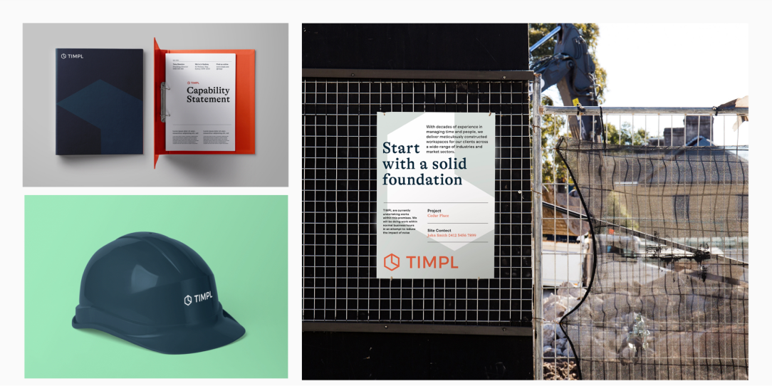
Using mock-ups is an effective way to showcase a brand system to clients and stakeholders, allowing them to visualize how the brand will be applied across various touchpoints.

Templates
Capability Statement
A capability statement was created using the brand system. This document plays a key role in the process of winning work, and it was important for Danny and Tony to have a professional and impactful capability statement that aligns with their brand.

Design
Microsite
I designed a microsite for TIMPL, providing a dedicated online presence that showcases their services, projects, and company information in an engaging and user-friendly manner.